
A mobile app development project.
Tasks
- Brainstorming for the names.
- Design a logo for the app.
- List the features to be added in the app.
- Design style guide.
- Prepare wireframes.
- Run user testing.
- Design High-Fidelity wireframes.
- Develope the app with HTML, CSS, and JS.
Features
- Features
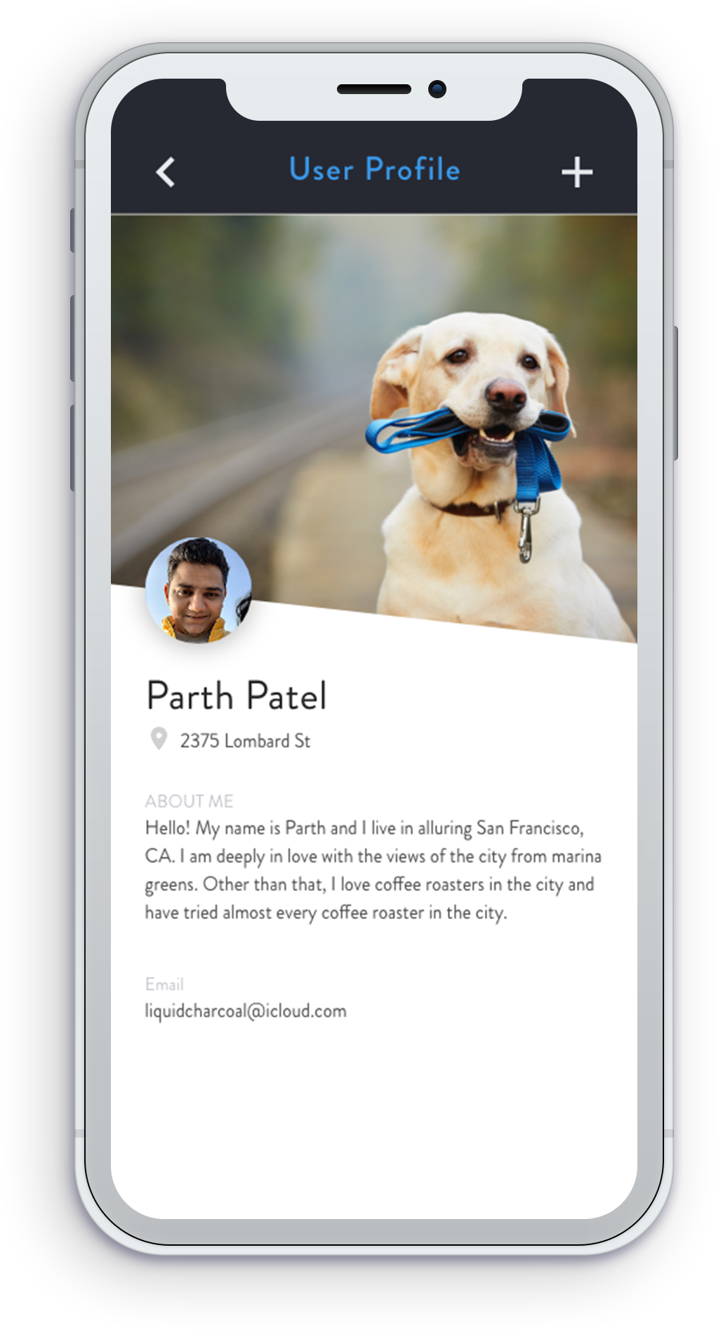
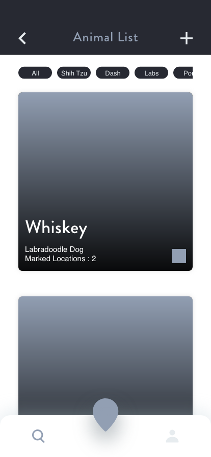
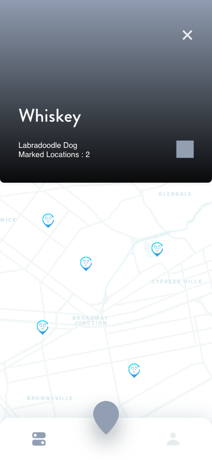
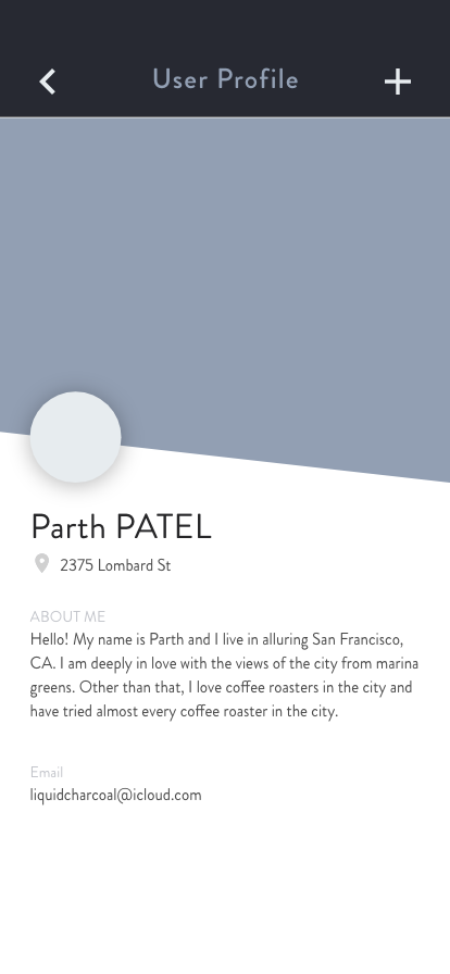
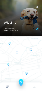
- Track a particular dog.
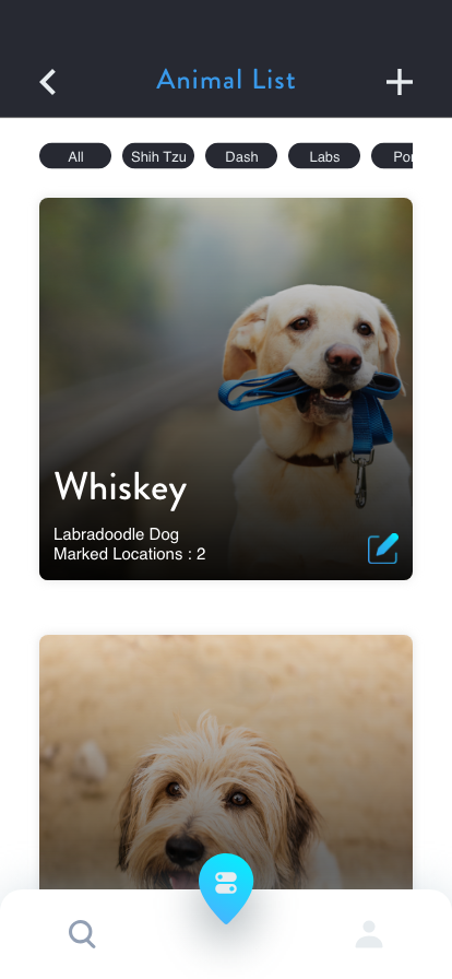
- Track based on the breed.
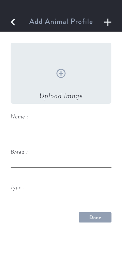
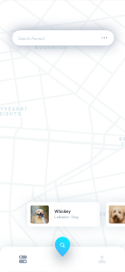
- Add a location to a dog.
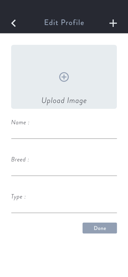
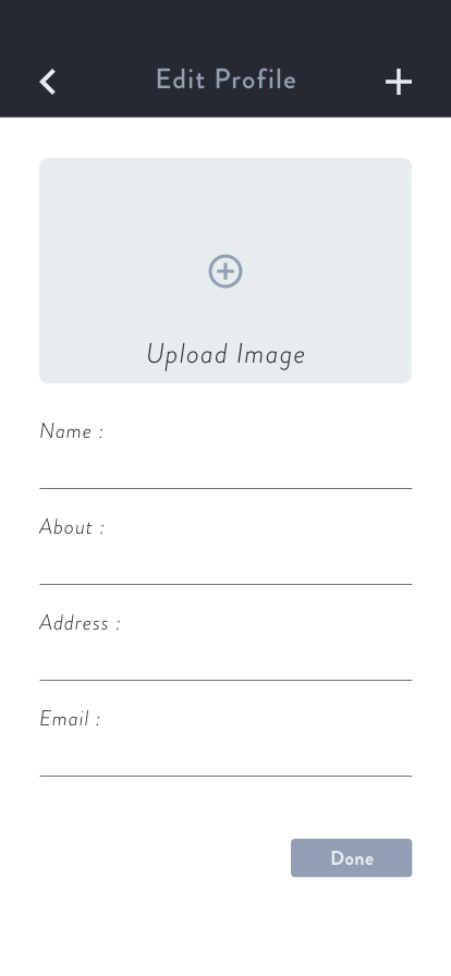
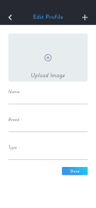
- Edit a dog’s information.
- Add a new location to a particular dog.
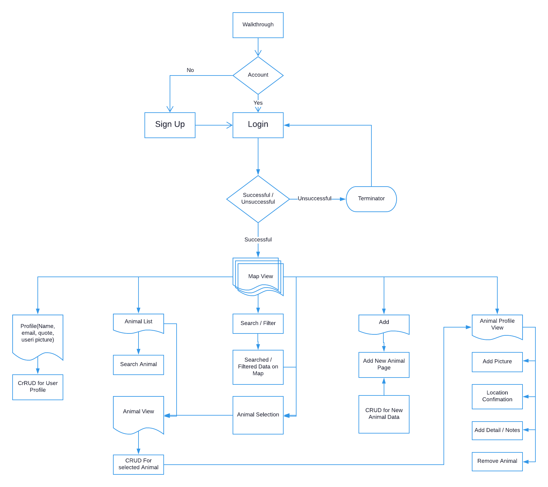
Site Map
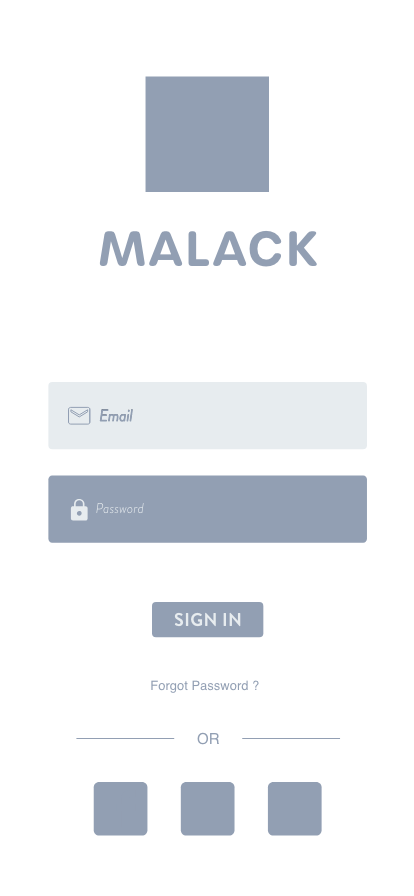
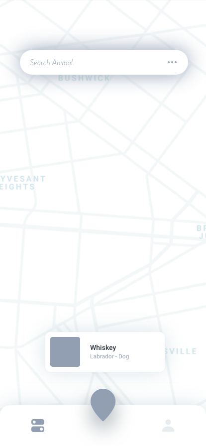
Wireframes
Development Technologies


Visual Design


Development
1. Designing with - An awesome CSS preprocessor.
Global variables:
                                $tool-height: 3em
$ub-fonts: urbane-rounded, sans-serif
$gr-fonts: brandon-grotesque, sans-serif
$fw-heavy: 900
$fw-bold: 700
$fw-dbold: 600
$fw-med: 500
$fw-reg: 400
$fw-light: 300
$fw-ex-light: 200
$fw-thin: 100
$text-right: right
$text-center: center
=type($font: $gr-fonts, $size: 1em, $weight: $fw-reg, $align: left);
    font-family: $font;
    font-weight: $weight;
    text-align: $align;
    font-size: $size;
    text-rendering: auto;
=text-shadow($x: 2px, $y: 2px, $blur: 5px, $color: rgba($dark, 0.4));
    text-shadow: $x $y $blur $color;
=box-shadow($x: 2px, $y: 2px, $blur: 5px, $color: rgba($dark, 0.4), $inset: “”);
    @if $inset != “”;
        +css3-prefix(“box-shadow”, $inset $x $y $blur $color);
    @else;
        +css3-prefix(“box-shadow”, $x $y $blur $color);
CSS3 gradient overlay on Image
.cover-image
    background: linear-gradient( rgba($dark, 0.25),
                rgba($dark, 0.65) ),
                url(‘image path’)
With use of gradient overlay technique of CSS background property you can easily avoid:
- Cretion of an overlay element.
- Styling and positioning of overlay element.
Pure CSS3 image shaping
.cover-image
background: linear-gradient( rgba($dark, 0.25),
rgba($dark, 0.65) ),
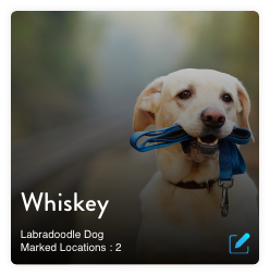
url(‘../img/animal_list_page/whiskey_lab.jpg’);
background-size: cover;
background-repeat: no-repeat;
background-position: center;
clip-path: polygon(0 0, 100% 0, 100% 100%, 0 calc(100% - 12vw));
Achievment by image shaping with CSS:
- No need of image processing scipts or software.
- Easy modification for future as image is still in original shape.
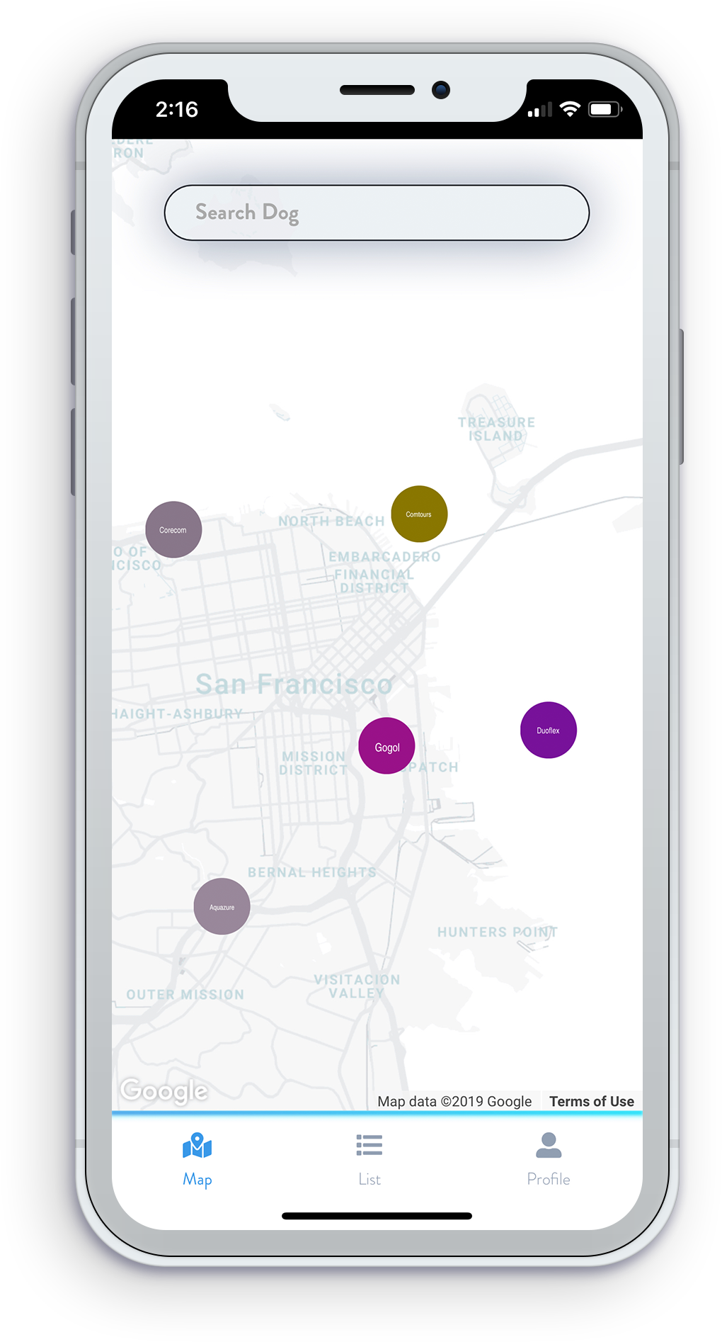
Styling google map markers.
.cover-image
    [src^=”map-marker-image"]
        border-radius: 50%
Achievment by styling markers with css.
-
No nee to process image for marker. It will get direct shape with border radius
- Wise use of CSS selectors means no JS hussle.
Styling google map markers with CSS is not possible directly because of the limitations of Google Map API. However, a smart way to do it is by naming the marker images with a specific naming convention in the begining of the image name and selecting with CSS string( ^ ) or substring ( * ) selectors.
Using mixin is like taking CSS to OOP world.
=flexbox;
    display: -webkit-box;
    display: -webkit-flex;
    display: -moz-flex;
    display: -ms-flexbox;
    display: flex;
%flexbox;
    +flexbox;
=inline-flex;
    display: -webkit-inline-box;
    display: -webkit-inline-flex;
    display: -moz-inline-flex;
    display: -ms-inline-flexbox;
    display: inline-flex;
%inline-flex;
    +inline-flex;
=flex-none;
    flex: none;
.flex-parent;
    +flexbox;
.flex-child;
    +flex(1, 1, auto);
.flex-none;
    +flex-none;
.flex-wrap;
    +flex-wrap(wrap);
.flex-vertical;
    +flex-direction(column);
// Flex align items;
.flex-align-items-center;
    +align-items(center);
.flex-align-items-stretch;
    +align-items(stretch);
.flex-align-items-start;
    +align-items(flex-start);
.flex-align-items-end;
    +align-items(flex-end);
You can grab full plugin here: SASS Flexbox mixin - by liquidcharcoal
Test it live.
The prototype of this app is live here: Malack App To get best out of the link. you might wanna turn on developer mode and choose responive device to make it look like a mobile app.